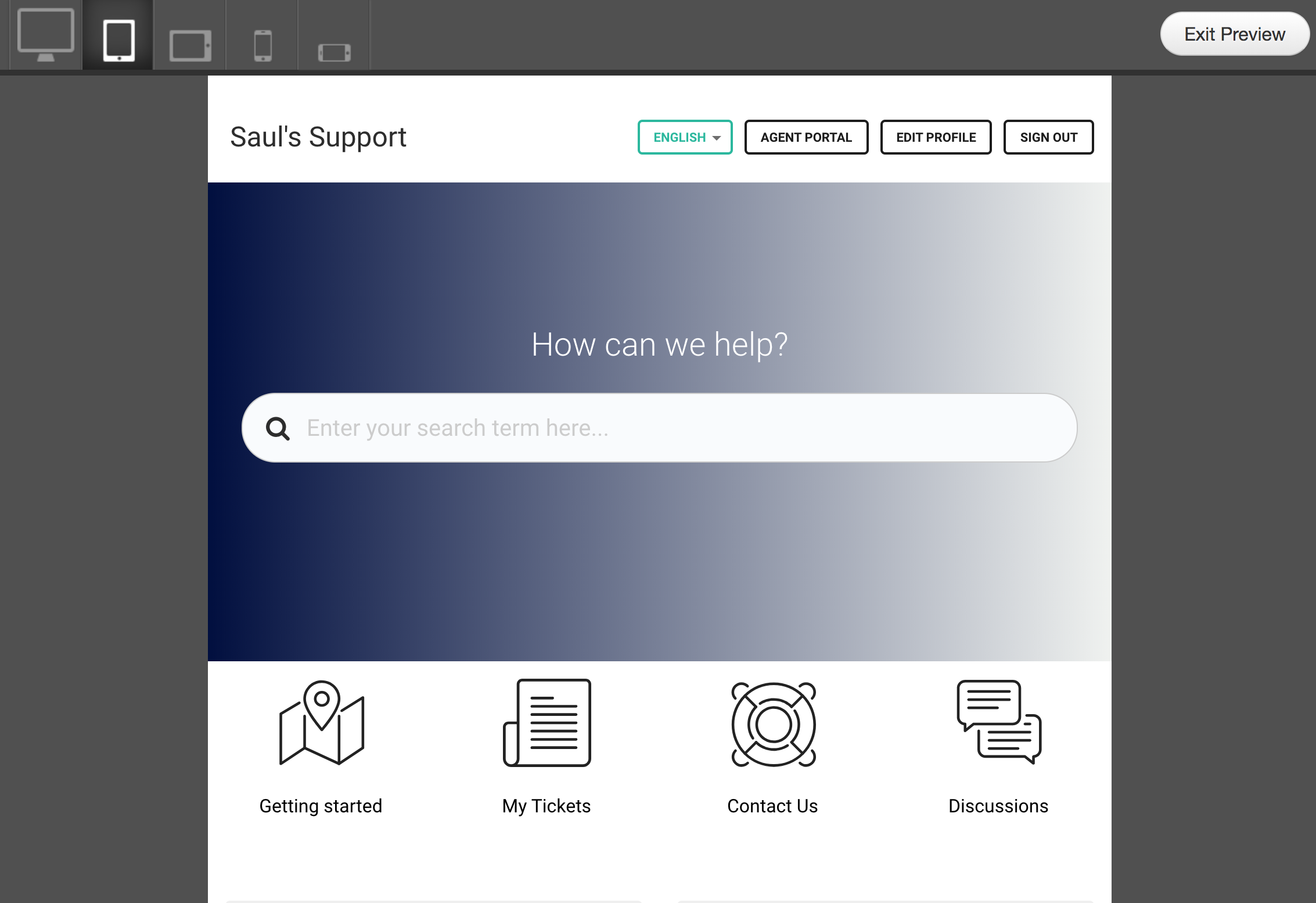
When you are customizing your theme, you want to be sure you got it right before you publish your changes to customers. The Preview button in Freshdesk's portal customization options lets you do just that, and helps you see how your theme looks on different devices.
This way, you get to work on your themes for as long as you need, without worrying about impacting customers. Whenever you take a break, or decide to take the rest of the day off, you could simply save the changes (and not publish them) and resume where you left off when you return. The Preview button lets you take a look at your theme while you are at work, make the changes you need, and publish just exactly what you want when you are ready.
How Responsive is your Theme?
The Preview page also lets you test your theme’s appearance across different devices. You can see what your new theme looks like on a desktop, tablet or phone, straight up or held horizontally. Once you are inside the page, use the tabs on top to check out how your theme looks on various devices. Make sure you optimize everything so they look good everywhere.

Here’s the default Freshdesk theme which is responsive across all devices.
Desktop:

Tablet:

Mobile:

